Monday, 12 May 2014
Thursday, 8 May 2014
Feedback Using 'Instagram' vol.2
After we found out about the problem about using a 'too similar' image in both poster and magazine cover, we couldn't decide which one to change so instead we created both new poster and magazine cover and again uploading them to 'Instagram' to see which media product would get the better response. Whichever one got the better response would replace the old one.

Once again we got a very speedy response from our target audience and turned out that the new poster got a greater amount of a reaction. As a result of this experiment, we replaced the old poster with the new one which was chosen by the audience.
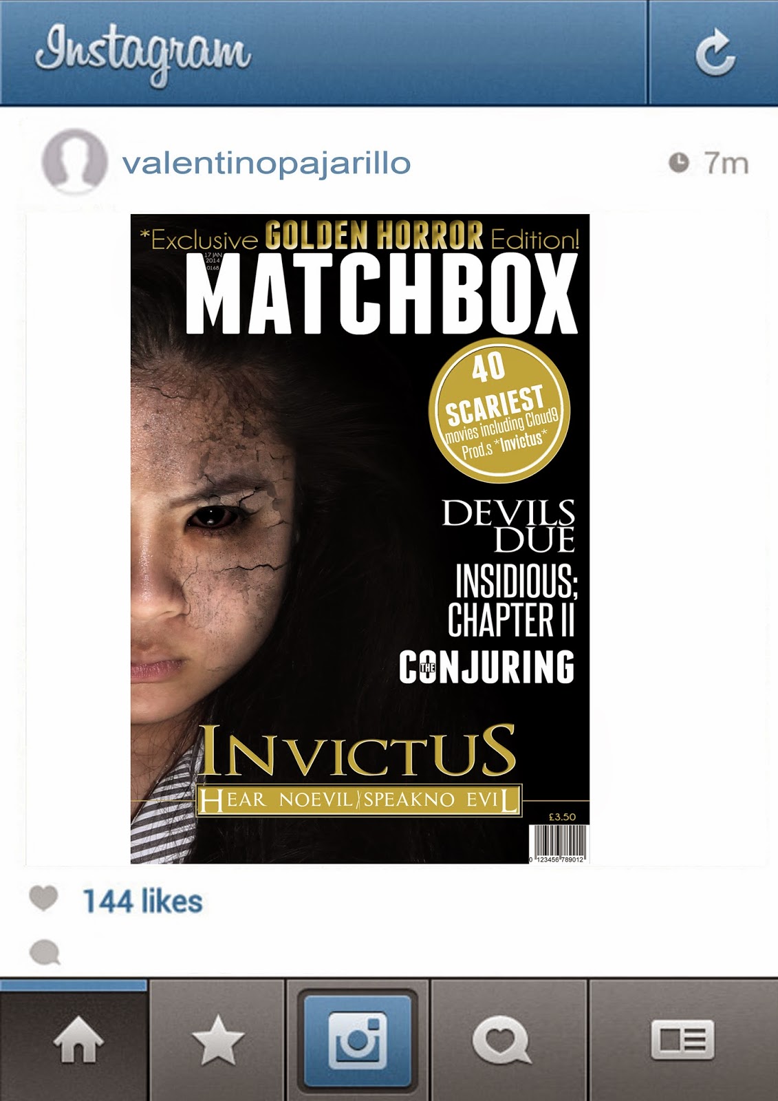
Feedback Using 'Instagram'
After the creation of our first drafts of the poster and magazine we wanted to see how our target audience would react to them using the smartphone app 'Instagram'.


As a result, we got a massively quick response from out target audience with a majority of positive comments.
Photo shoot cuts
During the Post production stage, while we was planning the lay out of the new poster and magazine cover, we where unhappy with some of the qualities of the pictures.


Their are some photos where they picture wouldn't be clear enough to be used for our products as they where a bit blurry. This was unacceptable as our goal was to create a film poster/magazine cover at a professional level and the quality of some of the pictures we took were just not up to standard.
For some of the pictures, the lighting was just off and just didn't suit our genre making the editing and the photo manipulation stage would be harder to do, therefore we didn't use these pictures either as they was not fit for purpose.
Decisions between poster ideas
+draft+2.jpg)
+draft+1.jpg)
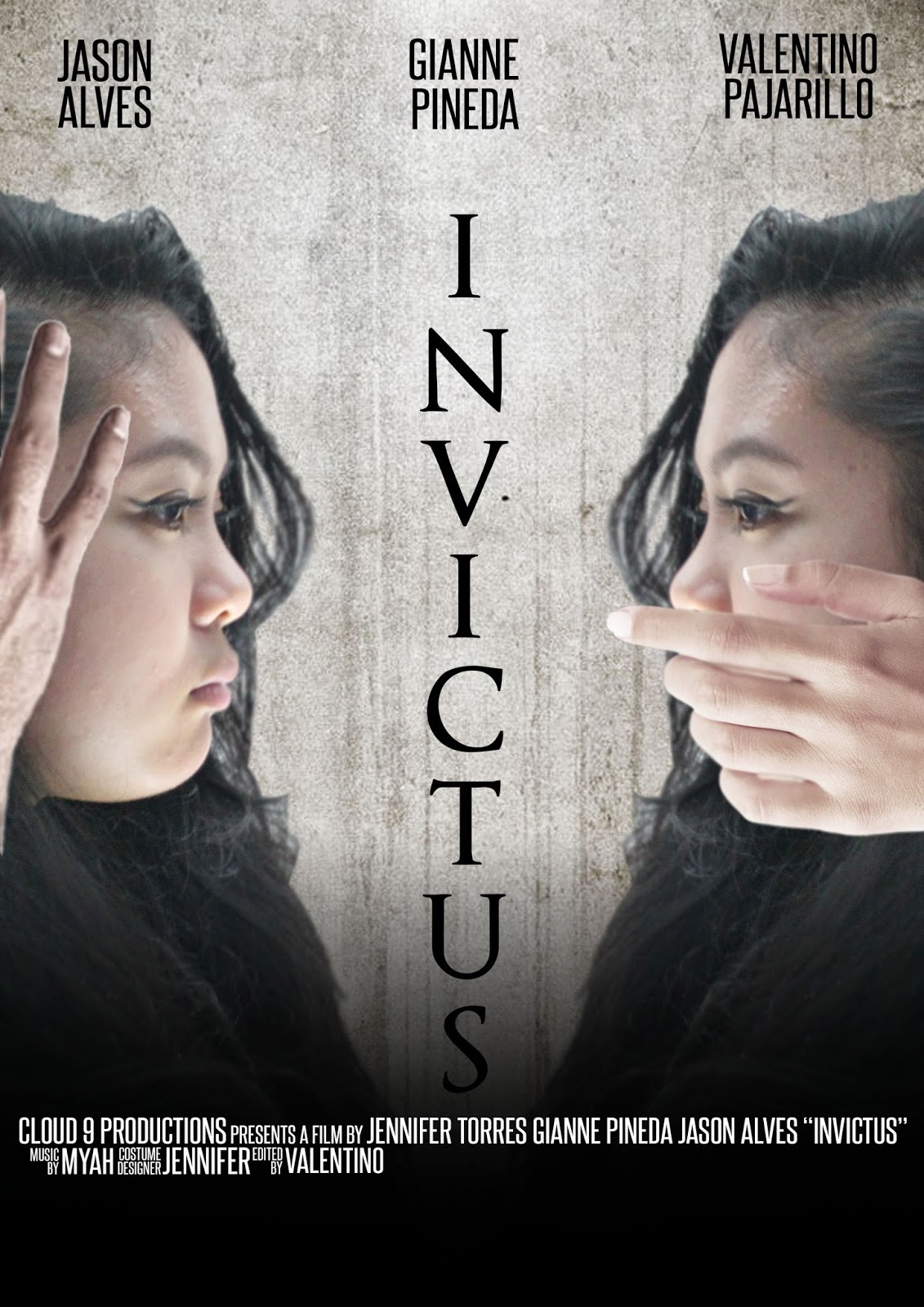
During the process stage of our new poster, we was originally going to stick with the idea of the spooky hands covering the protagonists hands, but we didn't want the images to be too similar so we then had to think of a way to show the protagonist slowly being possessed. This is when our main editor 'Valentino' came up with the idea of taking out the hands and putting the grudge effect growing from the area that were originally covered by the hands.
We didn't know if it would of worked as well as the hands so what we did was create both as an unfinished version, and let our target audience decide which they thought was best.
As a result, our audience loved the version without the hands covering parts of her face. some of the audience even commented that it worked even better, therefore we continued to work on the version without the hands on her face.
Question #3
In what way does your media products use, develop or challenge forms and conventions of real media products?

Subscribe to:
Posts
(
Atom
)