Showing posts with label Poster Production. Show all posts

Thursday, 8 May 2014

Decisions between poster ideas


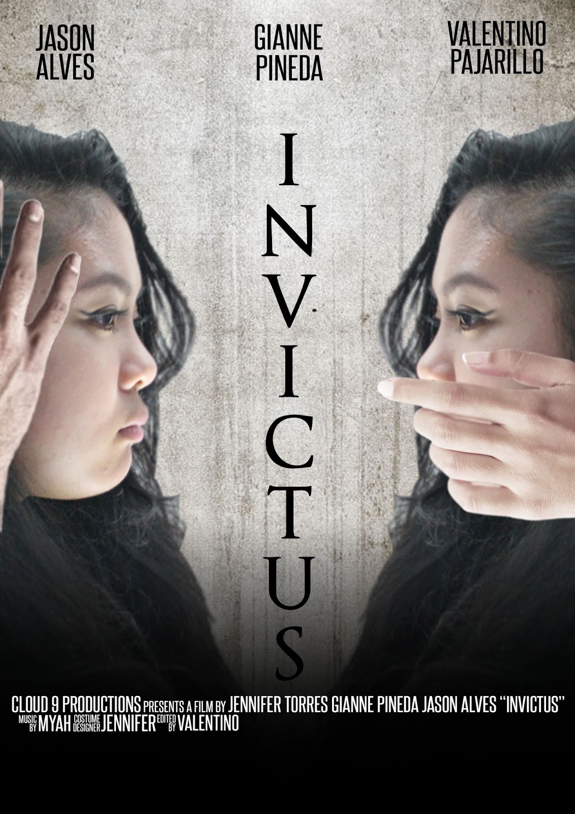
During the process stage of our new poster, we was originally going to stick with the idea of the spooky hands covering the protagonists hands, but we didn't want the images to be too similar so we then had to think of a way to show the protagonist slowly being possessed. This is when our main editor 'Valentino' came up with the idea of taking out the hands and putting the grudge effect growing from the area that were originally covered by the hands.
We didn't know if it would of worked as well as the hands so what we did was create both as an unfinished version, and let our target audience decide which they thought was best.
As a result, our audience loved the version without the hands covering parts of her face. some of the audience even commented that it worked even better, therefore we continued to work on the version without the hands on her face.

Sunday, 27 April 2014

Construction of Scary Effect on Poster

This is a little tutorial on how I constructed the scary image for our main poster.


Step 1;
First of all, what I did was I got the main image of my model and simply Transform (CTRL+T) it which allows me to just resized her and placed her in the position I wanted her to be in on my poster.
I then used the burn tool to darken certain parts of my models face to make her look a bit scarier. E.g. darken around the eyes.
Step 2;
I then got an image of a grudge texture from Google and resized and placed the image over the area on my model's face where I want the effect to take place.
Then to make the image of the grudge texture look like as if it is apart of my models face, I then changed the layer style from normal to Multiply. After, I then used the Erase tool and erased out all the areas of the grudge effect image I didn't want to give the effect of the cracks on her face are growing around her face.
Step 3;
Lastly, I wanted to play with the contrast and the colour of the whole image to make my model fit in with the back ground and theme of the movie a bit more so I used the 'Curves' Adjustment and made my own customer curves moving them up and down until I was happy with what the image looked like.
Once I was happy with the contrast of  light and dark areas of my poster I also noticed that it enhanced the colour on my models face which I didn't like so I then used the 'Hue/Saturation' Adjustment and lowered the saturation of the image.

Friday, 25 April 2014

Final Film Poster


We chose to use this one as our final film poster. After asking our class mates what they thought, this was the preferred one as they thought it was more effective and looked more professional. Our group also preferred this one because it was successful in conveying our genre in a professional way.

On the left where it says "Hear no evil", Valentino has edited the crackling effect on the side of the protagonist's face, near her ear to emphasise the word "hear" and the action of its property. On the right where it says "Speak no Evil", he has edited the crackling effect near her mouth to emphasis the word "speak" and notion of speech.

We decided to use the effect of cracks to show the corruption of the protagonist's character when she becomes possessed. The cracks near her ear represents the demon's influence on her mind that control her actions. She can only listen to the demon in the state of possession due to it's power and it being unbeatable - hence the title "INVICTUS" which is Latin for "unconquered / unconquerable / unbeatable".
The cracks near her mouth represents the corruption of the protagonists speech. Her own speech has been restricted by the demon who has possessed her. Instead, she begins to sing nursery rhymes in a creepy and unsettling way.

Choosing our Final Film Potser


As a last minute addition and effort to improve one of our products, our group created another film poster. We decided asked a number of people which poster we should use as the final one and why. Here are some of the things they said:

"I think they're both really good. I like the crackling effect you used on both of them but I do prefer the one with the protagonist facing herself. It seems more creepy, also more professional."
- Deborah, 19

"The contrast of black a white are really effective. I think the tones of grey make it seem more haunting. I like how the title is placed vertically in the centre which gives a mirror effect to the two images.
As for the other other one, I like how the background image is of the forest and the awesome editing that was probably used to create the image of hands coming out from nowhere. It almost gives you a 3D effect."
- Leola, 49

Tuesday, 1 April 2014

Construction of cracks

1.

 I searched for the appropriate image to use on Google. I then placed the image onto the area that I wanted to crack. 
2.


I then changed the image from 'normal' to 'multiply' in order for the image to appear transparent.
3.

I then changed the opacity from 100% to about 60% to make the image transparent further. 

5. 

I then changed the darkness and brightness levels by pressing 'Ctrl + L'. This was so I could precisely ensure that it is darker in specific parts of the cracks, this is also to make the cracks look more natural and not manipulated in. 
6. 

Here is where I added a vector mask to the image so that when I erase the unwanted parts of the cracks  the edges are well-defined, clean and smooth, this is to also ensure that the edges are not jagged.

7.

I then went around the image to removed the unwanted cracks, another alternative would of been to right click the layer and create a clipping mask.

8.

The final step was to select the burn tool, in which I went over some cracks to darken the effect and make it look realistic. The cracks connotes to the our genre of horror and would be a typical ideology of horror, using this effect would also attract our target audience.


Development of Poster


First Draft:  

This being this being the first draft of our poster, I had to manipulate and cut out the guy in the back in order for the poster to make sense. In which I used the pen tool to go around him, made a selection and cut him out. To ensure there were no harsh lines, I used to blur tool to make the cuts look more realistic. I then played around with a lot of the filters to dark the natural brightness of the picture. The idea was to darken the entire picture without making it look too filtered.        


Second Draft:  

Here is where I added titles and other basic conventions of a film poster. I also added a crack effect to the hands that is covering the actors mouth to make it look more creepy and broken. I found a cracked picture on Google, I then copied this onto the Photoshop document where I changed the image from 'normal' to 'multiply', I then positioned the cracks onto the hands and changed the opacity to about 60%. I further edited the cracks by pressing 'Ctrl + L' to changed the brightness and darkness levels of the cracks. I then had to add a vector mask to the cracks layer in order to cut out the unwanted cracks. Once the cracks were in place and looked okay I used the burn tool in some of the cracks to make the cracks look more natural. For the titles I used the font 'Trojan Pro' in which the colors appeared to be dark so this needed to be changed.  

Third Draft: 

This is where I added more titles, it's important for us to use all basic conventions in order for the poster to look as realistic as possible. I also added another layer which darkened the poster. Despite changed the titles from black to red they still appeared to look dark which needed changing as from audience feedback 70% of people said it was difficult to read and see. 

Final Poster: 

For the final draft I made the titles a lot brighter and also added the production companies icons. I also added a slight vignette just to darken the poster further. 


Sunday, 10 November 2013

Sketch: Film Poster - Initial Idea


This is the initial design of our poster. We wanted to ensure that our audience understood the meaning of 'Hear no Evil, Speak no Evil' in which we decided to actually get our actors to do the action for our poster. We got the inspiration to do this from existing horror film posters such as the Drag me to Hell film poster and the Mirrors film poster. We took specific conventions from each poster to recreate a realistic poster of our own.