Showing posts with label Research and Planning. Show all posts

Thursday, 8 May 2014

Feedback Using 'Instagram' vol.2

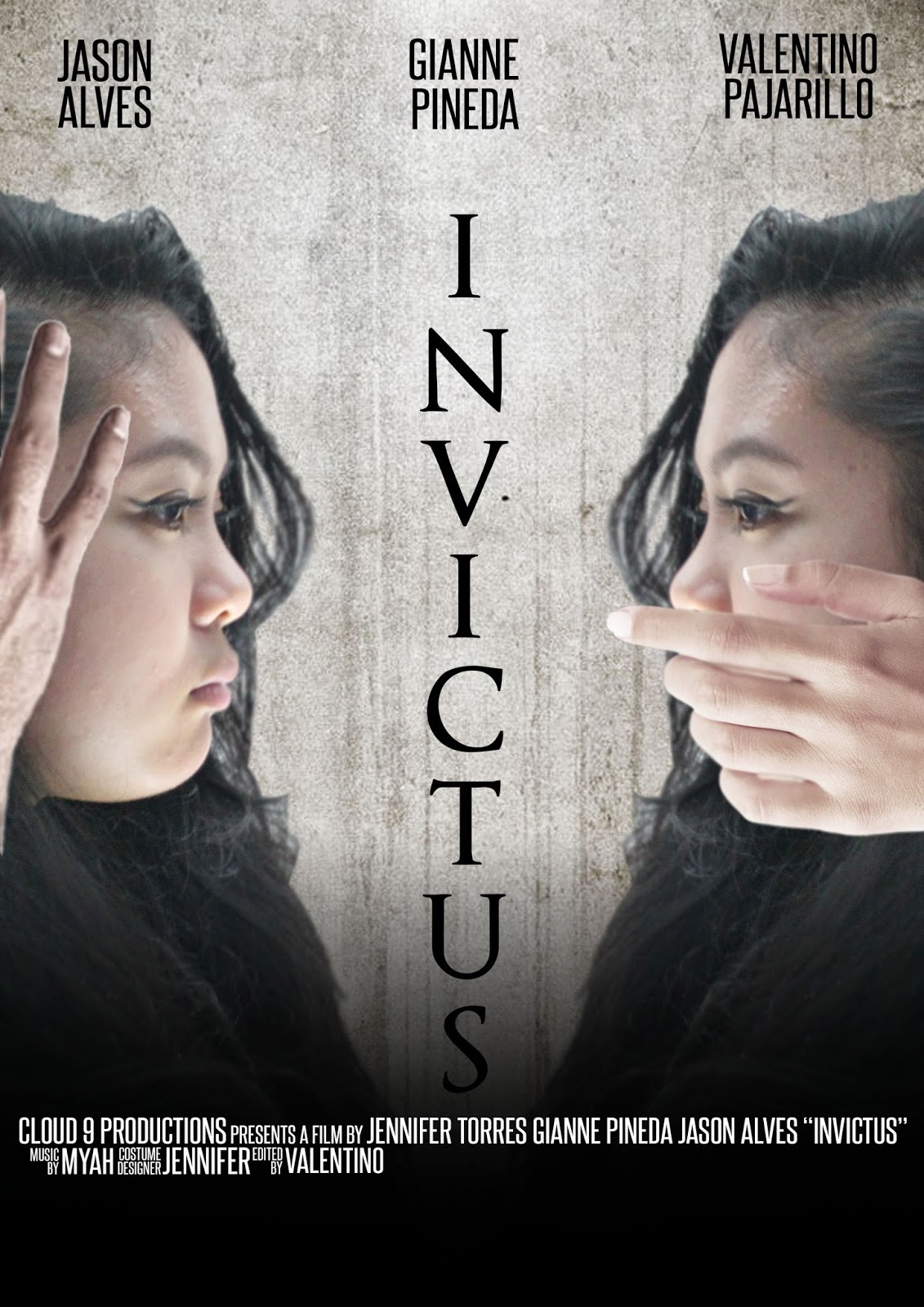
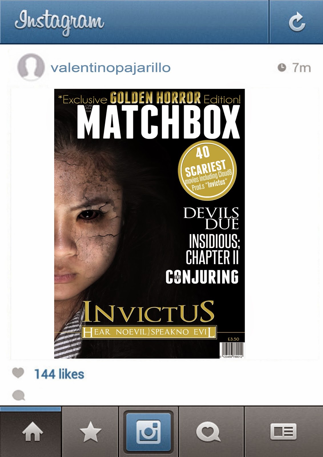
After we found out about the problem about using a 'too similar' image in both poster and magazine cover, we couldn't decide which one to change so instead we created both new poster and magazine cover and again uploading them to 'Instagram' to see which media product would get the better response. Whichever one got the better response would replace the old one.


Once again we got a very speedy response from our target audience and turned out that the new poster got a greater amount of a reaction. As a result of this experiment, we replaced the old poster with the new one which was chosen by the audience.

Feedback Using 'Instagram'

After the creation of our first drafts of the poster and magazine we wanted to see how our target audience would react to them using the smartphone app 'Instagram'. 


As a result, we got a massively quick response from out target audience with a majority of positive comments.

Photo shoot cuts

During the Post production stage, while we was planning the lay out of the new poster and magazine cover, we where unhappy with some of the qualities of the pictures.

Their are some photos where they picture wouldn't be clear enough to be used for our products as they where a bit blurry. This was unacceptable as our goal was to create a film poster/magazine cover at a professional level and the quality of some of the pictures we took were just not up to standard.


For some of the pictures, the lighting was just off and just didn't suit our genre making the editing and the photo manipulation stage would be harder to do, therefore we didn't use these pictures either as they was not fit for purpose.

Decisions between poster ideas


During the process stage of our new poster, we was originally going to stick with the idea of the spooky hands covering the protagonists hands, but we didn't want the images to be too similar so we then had to think of a way to show the protagonist slowly being possessed. This is when our main editor 'Valentino' came up with the idea of taking out the hands and putting the grudge effect growing from the area that were originally covered by the hands.
We didn't know if it would of worked as well as the hands so what we did was create both as an unfinished version, and let our target audience decide which they thought was best.
As a result, our audience loved the version without the hands covering parts of her face. some of the audience even commented that it worked even better, therefore we continued to work on the version without the hands on her face.

Sunday, 27 April 2014

Different Image Effects for Magazine

These were some of the different effects we tried on our model for our magazine drafts.


I made different versions of our magazine cover main image applying a different effect and then went out and asked some of our target audience to tell us which version they found best effective or the best looking for our magazine cover. as a result we ended up with a tally chard revealing that the image in the middle was most popular choice.

Monday, 20 January 2014

Sound Concepts and Music Development

Our group considered using certain sounds and nursery rhymes that we believed would work well in our trailer, as we has mentioned in our pitch that our "demonic book" would contain catchy melodies. We decided that scariest sounding nursery rhymed was "Ring around the rosie". We then decided to use YouTube to find an altered version that had different sound effects to fit the purpose of our trailer. We thought this version was very fitting and appropriate for our trailer and so will use it when editing our footage. We wanted the soundclip to fade in slowly over Gianne's singing which will act ass the catalyst in the course of her being possessed.


We decided that this wasn't enough however. We wanted to use a haunting melody throughout parts of the trailer that could be played softly during a scene where characters are speaking but then would increase dramatically when we do not wish to use diegetic sounds. We searched once again on YouTube and discovered the haunted music box melody which we thought was perfect for our trailer.


Friday, 6 December 2013

Location Ideas

FOREST 
Choosing the forest as one of our locations to film our trailer will help us to create a tense atmosphere. This location will be used to film Gianne walking through the forest along with Jason and Val. We will use a combination of shots from the handheld camera and the SLR. Gianne would show signs of possession and Jason and Val will react with panic and try to flee. This location will work well in relation to our sub genre of possession which is regarded to be part of the supernatural world. A lot of films and t.v series tend to use forests as locations when presenting werewolves, vampires etc. which are viewed as supernatural creatures.

CHURCH / GRAVEYARD
This location will help to support our sub genre. "Possession" in horror films and trailers tend to revolve around the Christian religion. Shooting in front/near a church will allow our audience to immediately relate the two together and make it clear to them that Gianne is in fact possessed, and by a demon from the Christian religion.
The graves will help to create fear amongst our audience. The graveyard will represent death and the dead which tends to make people feel uncomfortable and scared. This will help to create an eerie atmosphere.

LIBRARY
The library will most likely be our opening scene where we introduce the characters, Gianne, Val and Jason. Along with the characters, our main prop will also be introduced - The "demonic" book. Shots in the library will tell our audience that our characters are students and that the beginning is set in a school.


DARK ROOM/ CELLER
We will choose a dark room or a dark cellar to film Gianne is a state of "full possession". This location will give our editor a chance to work on the lighting for the cut.

Tuesday, 26 November 2013

Trailer Influences

We decided to make a horror teaser trailer and so we looked at a number of film trailers that we thought would help us with our approach to creating our trailer.

SINISTER
Some of our influences is from the trailer for the film 'Sinister'. They have a main prop that triggers the narrative of the story (the old projector). They continuously use shadows and dark lighting to present a frightening atmosphere.They also use the dark scenes to accent and hide the source of fear, which in this case is the character 'Bughuul'.
Towards the end of the trailer there is a series of flash cuts which increase the pace and in turn raise the level of tension and fear among the audience. The use of children as part of the concept is also an influence. They present an element of vulnerability which will make audiences want to sympathize with the characters.


PARANORMAL ACTIVITY
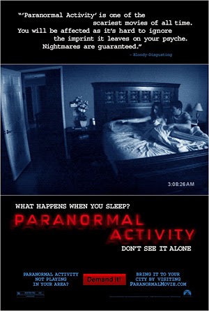
The trailer for Paranormal Activity is one of our main influences. There is a great use of handheld camera work which we will also use in our trailer. This presents the story as a documented event and gives it a sense of realism which makes it scarier for audiences. This trailer has limited footage from the film and relies more on audience reaction. There are audible aspects from this which are also used when the titles are presented.
The use of a handheld camera allows the audience to empathise with the characters and feel as though they are actually experiencing what is happening in the film.


THE LAST EXORCISM
The Last Exorcism was an influence to our theme of "posession". This is a key element in this film as the main character becomes so. From this trailer we can see how the possessed character acts, focusing on body language and speech so that we may be able to direct our own actor on how to present a character in a possessed state.

The feedback from our class on our first animated storyboard comments on the need for a greater use of titles in our trailer. The Last Exorcism trailer uses titles that tell audiences the location and key information about the first character introduced in the film.

Wednesday, 20 November 2013

Costumes

Since the characters for our teaser trailer are teenagers who attend sixthform/college we had them dress in suits to create a sense of realism. This also makes it easier for our target audience to relate or sympathise with the characters.

The male characters will be wearing black blazers, black trousers and a shirt which would be their school uniform.


Our female protagonist will be wearing a black blazer, a black skirt and tights, and a shirt as her uniform.

Monday, 18 November 2013

Tagline Ideas

Here is a brainstorm of ideas for the tagline of our trailer. We tried to come up with ones that closely relate to connotations of possession -which, in our trailer will be the humming and singing of a specific song the group had come across in the dangerous looking book they found in the library.


After a group discussion, we decided that our favourites were 'Hear no Evil, Speak no Evil', 'Death Comes to Those who Sing to It' and 'The Living might not hear you, but The Dead certainly will....No matter how quiet you try to be'.

We were very close to choosing the third one I previously mentioned, however, for a tagline we deemed it to be too long. As it was becoming troublesome for our group to decide on a tagline, we constructed a survey for our media class to answer, asking them which tagline they preferred.

Sketch: Film Magazine - Initial Idea #2


Saturday, 16 November 2013

Sketch: Film Magazine - Initial Idea


Before the construction of our film magazine we decided to start out by sketching our ideas. This provided us with a visual starting point before moving on to use Photoshop.

This is my sketch for our independent film magazine. I was inspired by the horror films, 'Mama' and 'The Grudge' where the antagonist's hair would stretch out and try to engulf and harm victims with it.
I drew only half a face and chose not to centre the character's face to remain unconventional which match the unusual quirks of independent magazines.

Contrasting this, in my sketch I included typical conventions of a magazine. For example, I drew a barcode and wrote an issue number which I placed in the bottom, left corner. I also gave the magazine a price.

Tuesday, 12 November 2013

Call Sheet


Title Ideas

Here is a brainstorm of ideas for the title of our trailer. We first centered our ideas around the primary prop in the trailer which would be the "The book". From there, we used Google Translator to find the translation for "book" in Latin which we believed would help to create a more eerie effect.


In the end we decided to choose "Invictus", the Latin word for "invincible, unbeatable, unconquered". We believe that it would relate well to the synopsis of the trailer as it revolves around possession and demonic components. The demon will be unbeatable and so the protagonists in the end, will be condemned to death.

Sunday, 10 November 2013

Sketch: Film Poster - Initial Idea


This is the initial design of our poster. We wanted to ensure that our audience understood the meaning of 'Hear no Evil, Speak no Evil' in which we decided to actually get our actors to do the action for our poster. We got the inspiration to do this from existing horror film posters such as the Drag me to Hell film poster and the Mirrors film poster. We took specific conventions from each poster to recreate a realistic poster of our own.